
Music Video
Feedback Improvements Attempt 2
After getting back my feedback I decided that a few alterations needed to me made. These simple changes make a large impact and will hopeful create a realistic digipak.
1.

First of all I changed the font used on the ablum cover to 'Myriad Pro' because this text is slightly longer than the other therefore the text is a little larger. Also I felt that it has a more intresting but still simple look to it. Then I changed the font on the lyrics to 'Birch Std' because it was easier to read and also looks more elegant which ties in with the rest of the digipak better. I then took of the written message from the artists which I am going to replace with a hand written version which was suggested in my feedback.
2.

Next it was suggested that the back page needed information adding which was one of the most important changes needing to be made. I used shapes to make the text more highlighted and easier to be seen because of the bright background. I added the singles name and a bonus track so people know what they're buying. Next I needed a barcode so this single can be bought in shops. After that I added a website for the artist so people can find out more infomration about her. Finally I added all the needed information about the rights for the indeptendent reccord lable 'Communion Records'.
3.

Then I added the logo for the record label she is signed to however when I added it there was a sharpe black background behind so I went on to blend mode and changed it to soft light, this aloud the logo itself to be white and to remove any block black.
4.

Next I added a hand writen letter from the artist, I firstly chose to do it on plain paper because I wanted to see if it looked more presentable. The writing didn't show up enough so I changed the blend mode to screen to make it writing darker.
5.

I then re did the hand written paper because I thought it looked more presentable. I used a rectangle shape on a 40% opacity to just highlight the letter making a boarded for it so that it is easily readable.
6.
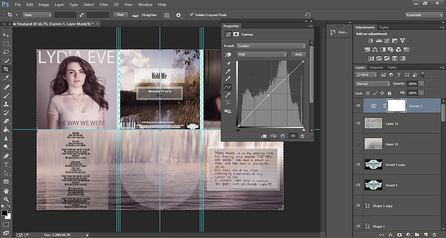
Then I added a slight high curve to raise the brightness of the whole digipak. This slight added brightness creates a great impact on the digipak standing out.
7.

Next I opened my digipak on 'open as' then when choosing the setting to open it as I chose 'Camera Raw' this allows me to edit the basic effects which make the largest impact and also makes the digipak look more professional. I editted all the colouring first to make sure it was extactly right.
8.

Next I turned up the 'Sharpening' to make sure all of the digipak its at its highest quaility to make it look as professional as possible. I then turned up the 'Luminance' to make the skin of the photographs of the artist look more flawless and also to correct any noise on the photograph.
9.

Finally I needed to turn up the masking, while I turned it up I held the 'Alt' key this allowed just the important outlines to be selected so that only the detail is sharpned.
By Jazmine Allen
Finished
